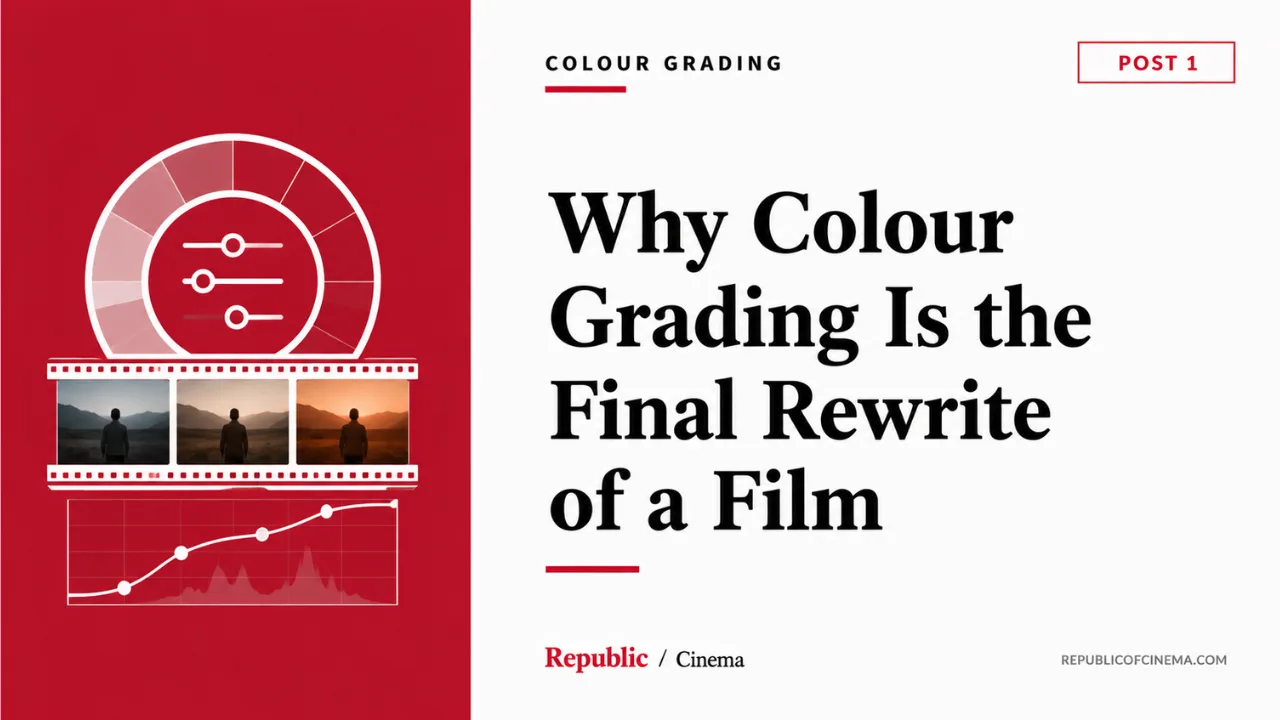
A film can be shot perfectly — every light placed with intention, every frame composed exactly as planned — and still arrive at its final color pass with a question nobody has fully answered yet: what does this story need to feel like, all the way through, once every scene sits next to every other scene for the first time? That question doesn't get answered on set. It gets answered in the grading suite, months later, by people most audiences will never think to credit. And the answer they give isn't a cosmetic touch-up. It's closer to a final rewrite of the film's entire emotional logic, executed not in words but in color.
This is the idea beginners consistently underestimate about this department, because color grading sounds, on the surface, like a technical cleanup phase — make the skin tones match, make the exposure consistent shot to shot, fix whatever went slightly wrong on the day. All of that is real and necessary work. But it's not what this department is actually for, and treating it as the whole job is how a film ends up technically polished and emotionally incoherent. The grade can shift an audience's entire sense of time, of place, of emotional temperature, without a single frame of picture being reshot or a single line of dialogue being rewritten. That power is exactly why this post calls the grade the last rewrite. It's the last chance a film has to align everything the audience sees with what the story is actually about.
Sidney Lumet's account of how he worked with his art directors to build color palettes for entire films proves this principle is not unique to the grading suite — it begins, as so much in this curriculum keeps insisting, with theme, established well before a camera or a colorist ever gets involved. "The Verdict is about a man haunted by his past," Lumet writes, describing his work with art director Ed Pisoni. "I told him we'd use only autumnal colors, colors with a feeling of age. That immediately eliminated blue, pink, light green, and light yellow. We looked for browns, russets, deep yellows, burnt orange, burgundy reds, autumnal hues." Notice what this process actually is: a color decision made before a frame is shot, derived directly from what the film is about, that then governs every choice downstream of it — set dressing, costume, location selection, and eventually, the grade that locks all of it into its final form. A palette built this way isn't decoration applied to a finished film. It's an argument about the film's emotional content, made in color instead of words, exactly the way Herrmann's score for Vertigo, discussed in this curriculum's Music department, makes its argument in sound instead of image.
Now look at the case where Lumet pushes this principle to its most explicit, structurally ambitious extreme, because it's the clearest possible demonstration of color doing narrative work that this curriculum could ask for — and it comes directly from his own account of building Daniel. The film moves between two timelines: the story of a couple caught up in 1950s Cold War-era prosecution, and the story of their now-grown children dealing with the inheritance of that history decades later. Lumet's solution wasn't simply to mark the two timelines with different costumes or different sets. He built the entire color logic of the film around the split. "In Daniel, the palette was critical," he writes. "Every color that was used for the parents had to be compatible with the heavy use of 85s that gave the parents' scenes the golden, warm amber glow we were after. The scenes with the grown-up children had to allow an emphasis on the blue or cold side. A warm brown would have fought against what we wanted to achieve with the grown children, and blue would have hurt us in the scenes with the parents."
Sit with the precision of that statement, because it tells you something the rest of this department will spend its modules unpacking in technical detail: color here isn't simply distinguishing two timelines the way a costume change or a different hairstyle might. It's encoding two entirely different emotional temperatures — warmth and memory for the parents' era, coldness and unresolved distance for the children's — directly into the image itself, so the audience feels the difference between these two worlds before they've consciously registered which timeline they're watching. And notice the discipline in his last sentence: a warm tone in the children's scenes would have actively worked against what that section of the film needed to achieve. This is the single most important idea in this entire post, stated plainly by someone who built it into a film decades before digital grading made this kind of control as flexible as it is today. Color isn't neutral. An ungrounded choice doesn't just fail to help. It can actively fight the story it's supposed to be serving.
This is also why look development has to begin on set, not in the grading suite, and why treating color as something to "fix later" is one of the most common and costly mistakes a production can make. Lumet's account of working with cinematographer Carlo Di Palma makes the underlying discipline explicit, in advice he says reshaped his entire approach to locations afterward: "Given a choice between two equally good exteriors or interiors, pick the one that is already the right color, the one that takes the least alteration by the use of light." This is color thinking happening at the location-scouting stage, before a single light has been rigged, before a single grading decision has been made — proof that an intentional color strategy isn't something layered on top of a finished shoot. It's a discipline that has to run through every department, from location selection through costume and production design, all converging toward a single coherent palette the grade will eventually lock into its final form.
This is precisely what Blain Brown's description of the modern Digital Imaging Technician's role formalizes for contemporary digital production. The DIT, Brown explains, "may monitor the camera signal on the waveform/vectorscope, create LUTs and Look Files... Some DITs also do basic color grading and work with the DP to achieve a 'look.'" A LUT — a lookup table, a preset mathematical transformation applied to the raw camera image — gets chosen or built during production, on set, specifically so that everyone watching dailies, from the director to the editor to the eventual colorist, is looking at something closer to the film's intended final look rather than a flat, uncommitted raw image. This is look development happening in real time, on the day, exactly the way Lumet's location and palette decisions did decades before LUTs existed as a technical term. The grading suite doesn't invent a film's color identity from nothing. It refines, extends, and finishes a creative decision that should already be alive on set, the same way Lumet's amber and cold-blue logic for Daniel was alive in his location choices and his discussions with his art director long before any frame reached a lab.
The DP–colorist relationship that eventually carries this work to completion functions on the same trust this curriculum has described between every other pair of collaborators in this curriculum — director and editor, director and cinematographer, choreographer and director. The Filmmaker's Handbook's account of how dailies actually get processed reveals how much creative latitude is preserved, deliberately, for that eventual collaboration: a flat transfer, the handbook explains, "involves creating an image that has visibly low contrast and preserves as many of the extremes of exposure as possible," precisely because committing to a strong look too early, during the initial film-to-digital transfer, "may lock you into particular looks that can't be undone later." The image coming off a flat transfer looks deliberately unappealing, deliberately uncommitted, specifically so the eventual grade has the maximum possible range to work with. This is a structural decision built around protecting the DP and colorist's eventual collaboration from premature commitments made in haste, on the day, under the pressure of a shooting schedule. The cinematographer who lit the film and the colorist who will eventually grade it are, in the most meaningful sense, the same creative authority operating at two different moments in the process — one capturing the raw material with the eventual grade already in mind, the other completing what the first could only gesture toward on set.
Now turn to a context where this entire department's working culture has shifted dramatically within a single decade, driven less by any single visionary director's color philosophy and more by an entire industry's changing relationship to where and how its work gets watched: the OTT era's transformation of grading culture in Indian production.
For decades, a significant portion of Indian commercial cinema was finished with theatrical projection as its only meaningful viewing context — a single, controlled environment where a grade only had to hold up under one specific set of conditions. The arrival of streaming platforms as a primary distribution channel changed that calculation completely, and not simply because streaming added a second viewing context alongside theatrical release. It changed the entire baseline of what Indian audiences, and crucially what international audiences newly exposed to Indian content through global platforms, expected a film or series to look like. A grade now has to survive being watched on a calibrated cinema screen, an ordinary television, a laptop with mediocre color accuracy, and a phone screen in daylight — the same range of viewing conditions the Filmmaker's Handbook describes filmmakers needing to anticipate when checking how a surround mix collapses into stereo, applied here to color instead of sound. This single shift in distribution infrastructure raised the technical floor across the entire industry, because productions competing for attention on the same platforms as international content, often programmed in the same menu, alongside films graded by some of the most well-resourced post-production pipelines in the world, could no longer afford grading work that looked noticeably less considered by comparison.
This has had a real, traceable effect on how Indian productions plan and budget for this department specifically. Where grading on a significant portion of commercial Indian cinema was once treated as a late-stage technical pass — color correction in the most literal sense, matching shots and fixing exposure inconsistencies rather than building a deliberate emotional palette — the OTT era has pushed a growing number of productions toward treating the grade the way Lumet treated Daniel's warm-and-cold split: as a creative decision considered from the earliest stages of cinematography planning, not a corrective measure applied at the end. Streaming platforms' own content guidelines and delivery specifications, often demanding consistent color management across an entire series rather than a single ninety-minute feature, have additionally pushed episodic Indian productions toward exactly the kind of palette discipline this post has described in Lumet's work — a deliberate, theme-driven color identity that has to hold consistent across many hours of running time and, increasingly, across multiple directors and cinematographers working on different episodes of the same series, a problem theatrical filmmaking rarely had to solve at this scale.
What this OTT-driven shift reveals, more than any single technical innovation, is the same lesson this entire post has been building toward: audiences may not consciously analyze a grade, but they absolutely register when one production's color work feels considered and another's feels arbitrary, and that registration shapes how seriously an audience takes everything else the film is trying to do. A film with meticulous cinematography and a careless grade undoes its own craft at the final stage, the same way a brilliant performance undone by a confusing cut, discussed in this curriculum's Editing department, loses everything the performance earned. The raised baseline the streaming era has created isn't really about chasing a more "premium" look for its own sake. It's about an entire industry catching up to a truth Lumet had already proven, scene by scene, decades earlier: color is never neutral, and a film that doesn't control it deliberately is letting its emotional logic be decided by accident.
This is the test worth carrying forward into every grading decision you'll ever be involved in, on either side of the DP–colorist relationship: does this grade serve the same theme that governed every other department's choices on this film, or has it drifted into decoration, doing nothing more than making the image look pleasant in a way disconnected from what the story actually needs felt? An ungrounded grade — warm where the story needs cold, vibrant where the story needs drained and exhausted, glossy where the story needs raw — doesn't simply fail to help. It actively works against everything the rest of the production built, the same way a warm tone in Daniel's scenes with the grown children would have fought against the very distance and unresolved coldness those scenes needed the audience to feel.
The modules ahead in this department will take apart the practical craft this post has only introduced the philosophy of — how a colorist actually works through scopes and waveforms to build a look shot by shot, what a DI (digital intermediate) session actually involves from first pass to final delivery, how color continuity gets managed across a film shot in dramatically different lighting conditions, and how specific colorists and DPs across world and Indian cinema have built recognizable visual signatures entirely through the discipline of the grade. None of that craft will matter, though, without the foundation this post has tried to establish first: the grade is not where a film gets cleaned up. It's where a film's emotional argument gets its final, and often most powerful, draft.
💬 Discussion
0 comments